The plugin is designed to showcase a variety of content types including images, banners, videos, and sliders, providing a visually engaging user experience on nopCommerce platforms.
Creating a slider
To create a slider navigate to Plugins => Noptech => SliderRevolution => Sliders and click Add new button.
Settings
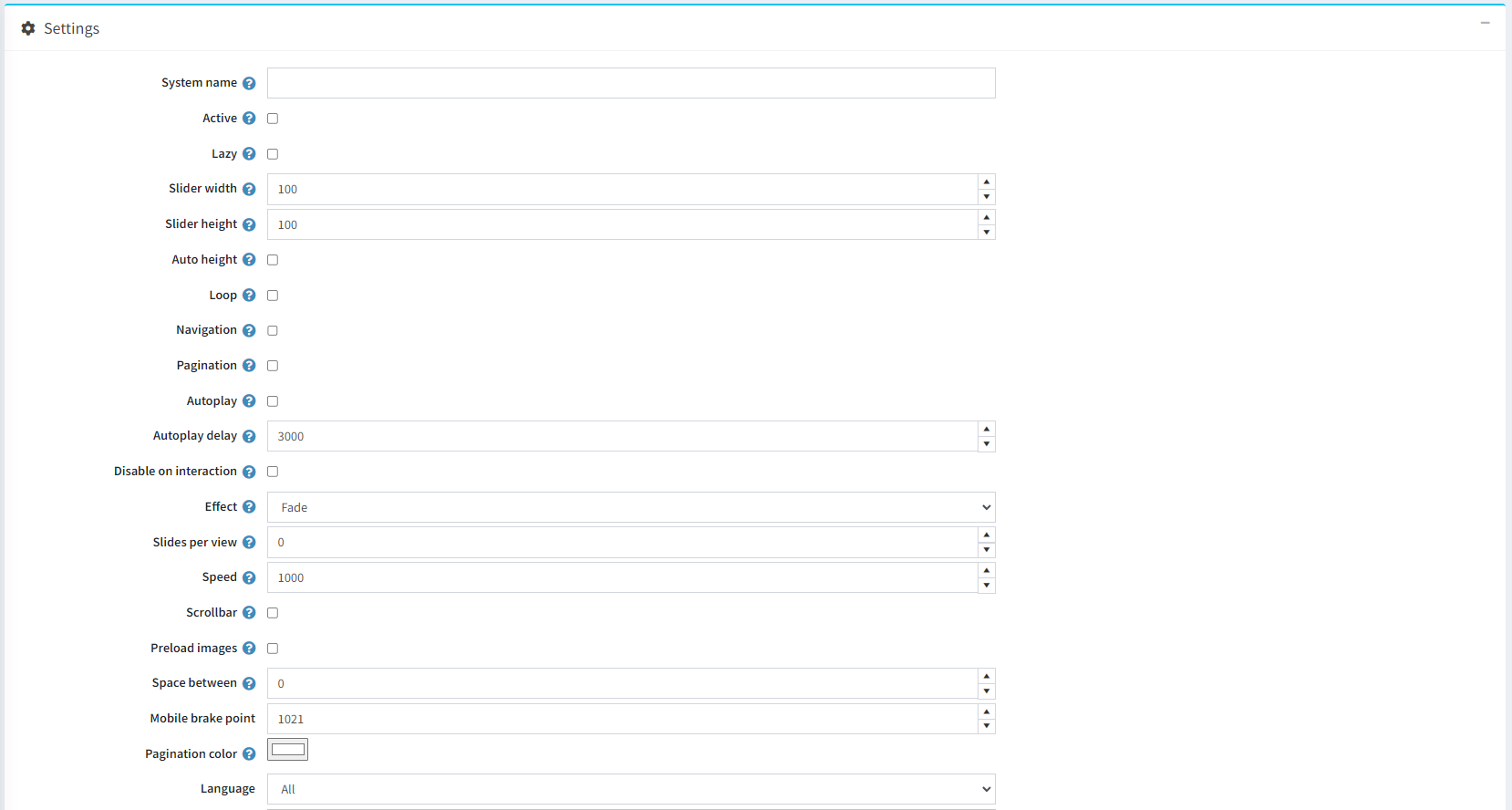
- System name: The system name of the slider.
- Active: Whether the slider is active or not.
- Lazy: Activates lazy loading.
- Slider width: Specifies the slider width.
- Slider height: Specifies the slider height.
- Auto height: The slider will adapt its height to the height of the current slide.
- Loop: Enables continuous loop mode.
- Navigation: Adds navigational arrows to the slider.
- Pagination: Adds pagination dots at the bottom of the slider.
- Autoplay: The slider will play automatically.
- Autoplay delay: Delay between transitions (in ms).
- Disable on interaction: Disables the autoplay mode when user swipes.
- Effect: Specifies the slider effect.
- Slides per view: Specifies how many slides will be visible at the same time.
- Speed: Duration of transition between slides (in ms).
- Scrollbar: Adds a scrollbar to the slider.
- Preload images: Whether you want all media to be preloaded or to be loaded just in time.
- Space between: Specifies the space between slides.
- Mobile breakpoint: Specifies the pixels where slider comes to 'mobile' mode.
- Pagination color: Specifies the color of the pagination.
- Laguage: Specifies the language of the slider.
Adding slides (pictures)
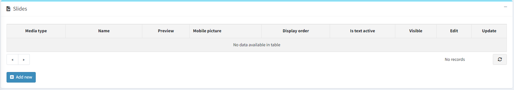
When you save the settings you will see another window with your slides (see the picture above). Click on Add new button.
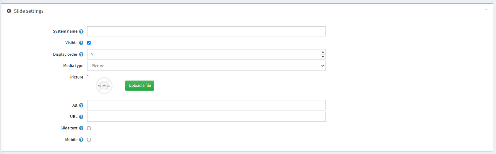
- System name: System name of the slide (picture).
- Visible: Specifies whether the slide is visible to the public store or not.
- Display order: The order of the slide (used for sorting).
- Media type: Whether you visualize picture or video in your slider.
- Alt: Alternate text for the slide (if cannot be loaded).
- Url: Link for redirection when the slide is clicked.
-
Slide text: Enables/Disables text on the slide.
- Slide text top: Affects the vertical position of the text.
- Slide text left: Affects the horizontal position of the text.
- Slide text width: Affects the width of the text.
-
Mobile: Enables/Disables mobile settings.
- Mobile picture: Upload picture for mobile devices when slider hits 'mobile breakpoint'.
- Mobile Text: Text for mobile devices when slider hits 'mobile breakpoint'.
Widget zones
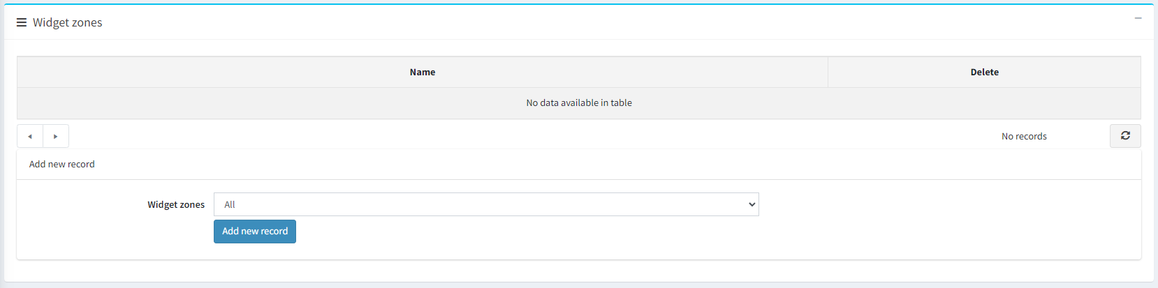
Choose the widget zone from the dropdown menu where your slider will operate and click Add new record.
Note!
You can have multiple sliders in one widget zone.